|
|
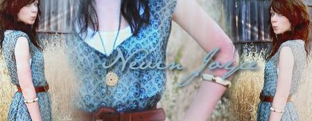
Post by ann on Jul 10, 2007 18:06:24 GMT -5
10/10
|
|
|
|
Post by katiexsnow on Jul 10, 2007 18:08:57 GMT -5
7/10
I like the pictures and everything, but it's a bit too plain for me.
|
|
|
|
Post by dannyharrop on Jul 10, 2007 19:35:53 GMT -5
7/10
I love the words and font and what not, but it looks to 'photoshoppy' if you get what I mean. The pictures look to obviously stook on. You should have a yellow background for hufflepuff yay hufflepuff!
|
|
|
|
Post by nevin_joyce on Jul 11, 2007 14:36:02 GMT -5
10/10
I don't really know why I love this so much, but I do. Kudos to whoever made it, they did a good job.
|
|
|
|
Post by bobbyv1 on Jul 11, 2007 14:48:22 GMT -5
10/10
This is my style of making graphics and I have always liked it...
Good job to who made it...
|
|
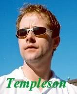
Kenny Templeson
 Fourth Year
Wind Elementalist Fourth Year
Wind Elementalist
Chaser
Sounds of laughter shades of life are ringing through my open ears inciting and inviting me
Posts: 241
|
Post by Kenny Templeson on Jul 22, 2007 22:36:12 GMT -5
10/10
Nothing more I can say but it's better than mine
|
|
|
|
Post by listen on Jul 23, 2007 2:20:29 GMT -5
7/10
it's wayyyy too big and just a picture with words stuck on it
that said, the font/color flows well with the picture :]
|
|
|
|
Post by piper on Jul 23, 2007 10:59:30 GMT -5
10/10
Its really cool.
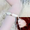
I like the random spot of blue while everything else is black & white.
|
|
Kenny Templeson
Fourth Year
Wind Elementalist
Chaser
Sounds of laughter shades of life are ringing through my open ears inciting and inviting me
Posts: 241
|
Post by Kenny Templeson on Jul 23, 2007 22:14:48 GMT -5
9/10
Really Colorful and I mean Really
|
|
|
|
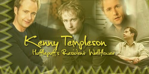
Post by jediman500 on Jul 24, 2007 3:33:19 GMT -5
6/10
Too square and not centered. Sigs always look better when they're centered, in my opinion. Other than that, it's pretty good. Like the "Hufflepuff's Newest Member" bit and the fact that it has his personality traits in it is a good addition. But I think it'd look better with two bigger pictures rather than one big one and three small ones. And Centered.
|
|
|
|
Post by piper on Jul 25, 2007 0:36:52 GMT -5
XD
I like the words XD
I guess.... hm... 8/10 maybe 9.
|
|
|
|
Post by aspen on Jul 26, 2007 20:25:02 GMT -5
9/10
CUTE! I like it a lot!
|
|
|
|
Post by busybeth on Jul 26, 2007 20:29:50 GMT -5
9.5/10.
It's really cute!! I love it!
|
|
|
|
Post by jediman500 on Jul 26, 2007 20:35:41 GMT -5
7/10
The only reason I say so is because it's just a square picture and some words above it. But The words are really great.
|
|
|
|
Post by aspen on Jul 26, 2007 20:36:59 GMT -5
3/10 I'm sorry, I don't like this at all.  |
|