|
|
Post by listen on Jul 26, 2007 21:59:23 GMT -5
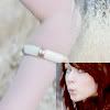
9/10
just a bit too much going on
in the sig and that whole area
|
|
|
|
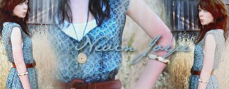
Post by nevin_joyce on Jul 26, 2007 22:12:17 GMT -5
9/10
It makes me kinda sad that I can't see his whole face, but I love it other than that
|
|
|
|
Post by Odette 'Mare' Fortune on Jul 26, 2007 22:16:37 GMT -5
8/10
Super duper fonttt. x33 I wuffle it. =o
I also like how you could fit those pictures perfectly in there in such a small space
and the fonty-thingies. x3 Nice jobbb. But the black and white kind of
depress me, and maybe the middle violet font should be a tiny bit bigger. Besides that,
perfecto. |
|
|
|
Post by kaddy on Jul 26, 2007 22:53:14 GMT -5
8/10
the pictures blended together is real nice
but the stamps on it are kind of...hm. i don't know if distracting is the right word,
but they just don't seem to fit.
and the text would be better if there was a drop shadow or something on it.
|
|
|
|
Post by nevin_joyce on Jul 26, 2007 23:15:37 GMT -5
9/10 because the quality of the pictures
other than that, i think it's fantabulous
|
|
|
|
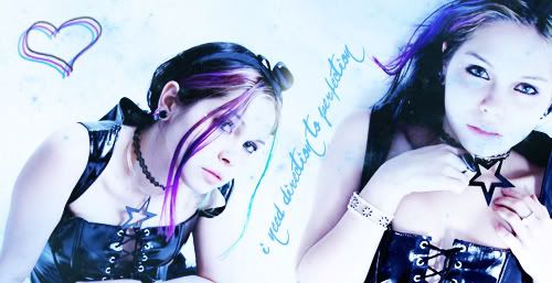
Post by jediman600 on Jul 27, 2007 0:08:12 GMT -5
9/10
Lots of colors...I likes da rainbow. The only thing detracting from it is the font at the bottom. It's just a little hard to read.
|
|
|
|
Post by listen on Jul 27, 2007 0:20:42 GMT -5
6/10
it's well done but
the bottom text is hard to read
and i just think the red+blue is ugly ;x
|
|
|
|
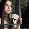
Post by rosalina on Jul 27, 2007 0:22:58 GMT -5
4/10
Sorry, but it's way too small and a siggy is suppose to show your characters face right? It's only showing half of it...and I can't really read the font on the bottom. Sorry!
|
|
|
|
Post by Stephanie.Lily.Zawatsky on Jul 27, 2007 0:26:52 GMT -5
personally i dont think so
because if i just say THIS IS HOW HE LOOKS it limits imagination
haha
8/10
i dont particularly like the font used for the words
and the lip things seem kind of out of place
but besides that it's good
|
|
|
|
Post by rosalina on Jul 27, 2007 0:31:36 GMT -5
well if somebody wants to know what your character looks like, they can't just tell by a portion of their face can they?
i mean all its showing is an eye and some hair.
xD
but your right...it's creative..imaginative..
i totally agree with that
9/10
it's purtiful
i really like the eye color
but whats with that pink blob on his face?
xD
thats the only thing stoppin it from being an almighty 10.
|
|
|
|
Post by listen on Jul 27, 2007 0:36:44 GMT -5
hehehe
it's a girl
and that's a cloud <3
since the quote has weather in it
PERSON BELOW ME
IGNORE MY SIG AND RATE ROSALINA'S xD
i just wanted to reply
|
|
|
|
Post by faithless on Jul 27, 2007 0:45:08 GMT -5
Rosalina: 7/10, it's a pretty sig but I'm not much of a fan of Shakira.
...that is Shakira, yes?...
Sam..x4: 9/10, veddy cute. :]
|
|
|
|
Post by ariina on Jul 27, 2007 0:47:29 GMT -5
10/10.
Mind blowing. Just absoloutly mind blowing. Where'd ya get those brushes from? DDX
-envywaves- |
|
|
|
Post by listen on Jul 27, 2007 1:06:53 GMT -5
9.5/10
her name is a little hard to read
besides that it kicks ass
|
|
|
|
Post by kaddy on Jul 27, 2007 2:09:59 GMT -5
10/10
i think it's a beautiful graphic.
|
|